DTE ENergy
Powering an Improved Customer Experience
What if... we could help a leading energy company improve its customer experience and internal processes through a strategy-based approach?
DTE Energy is a diversified energy company involved in the development and management of energy-related businesses and services. Headquartered in Detroit, DTE and its subsidiaries include more than 10,000 employees and serve communities in more than 20 states across the US.


Strategic Insight
Advances in technology and consumer experiences are changing customer expectations for every interaction they have, including with their utility providers. In the face of this changing landscape, leading energy companies are making great strides in improving the user experience (UX) in order to remain their customers’ go-to partners in energy and home management.
DTE was working to overcome some issues with its online presence and needed a digital partner to help solve these problems and streamline its customer experience.
We listened and learned about DTE’s goals, then applied our expertise in digital strategy and experience design, deep roots in the energy and utilities industry, and front- and back-end technology capabilities to create a holistic, end-to-end approach to help DTE achieve its goals.

Reimagining the “Save Money & Energy” Journey
Improving the experience for customers wanting to be more energy efficient was one of the first goals DTE wanted to accomplish.
The company had more than a dozen Energy Waste Reduction (EWR) programs listed on its website – each designed to enable and incentivize efforts like recycling old appliances, installing insulated windows, and switching to energy-efficient light bulbs – but the programs existed in silos and lacked a cohesive customer journey. Similarly, helpful energy-saving tips were located separately from relevant products and programs where they applied, forcing the user to move across multiple pages.
DTE wanted to improve several key performance indicators (KPIs) surrounding the EWR experience, including:
- The percentage of visitors who complete EWR-related tasks
- The percentage of users labeled as “energy savers”
- The number of users at each level of engagement
- Page and video interactions
- Out-bound clicks for further information
Collaboration to Fuel Striking Digital Design
Our combination of digital design and technology expertise led to us being chosen to lead this project. We partnered with an incumbent agency DTE had been working with to accomplish the customer journey redesign in three phases: inception, design, and build.
The inception phase involved several discovery workshops where we met with customers and key stakeholders within DTE to explore requirements the updated EWR journey should meet. We combined those insights with UX best practices, past experience with energy clients, and current industry research to create a set of recommendations, such as making the voice and tone of the content.
- More conversational and user-friendly
- More action-oriented when users need to apply for a rebate, schedule an appointment, or fill out a form
- More informative on smart home devices and other recent and emerging trends for energy savings

Crafting a User-Friendly New Experience
Based on our findings and recommendations, we designed the new Save Money & Energy experience and built it in DTE’s existing IBM content management system (CMS). This included reducing the original number of web pages by 20%, which streamlined the experience by consolidating information on related topics that had previously lived on multiple pages. We also added new pages to modernize the content, providing customers with information on smart devices, smart homes, and the DTE Insight app.
We performed user testing to validate the new megamenu and page layouts as well as findability. Test participants were tasked with various scenarios for finding information and the results were strongly positive. Testers routinely completed each task efficiently and they praised the close proximity of copy and relevant CTAs. Based on tester comments, we further simplified page content by consolidating DTE program descriptions and customer eligibility requirements into a more quickly consumable format.

Engaging Customers Through Interactivity
Part of the EWR redesign involved creating new points of entry for the Save Money & Energy journey. DTE wanted to provide fun, engaging ways to introduce customers to its various programs and educate them about saving energy.
We responded by developing an interactive quiz in which a user selects four statements that best represent them. The responses generate customized recommendations, energy-saving tips, and links to Save Money & Energy pages for more in-depth information.
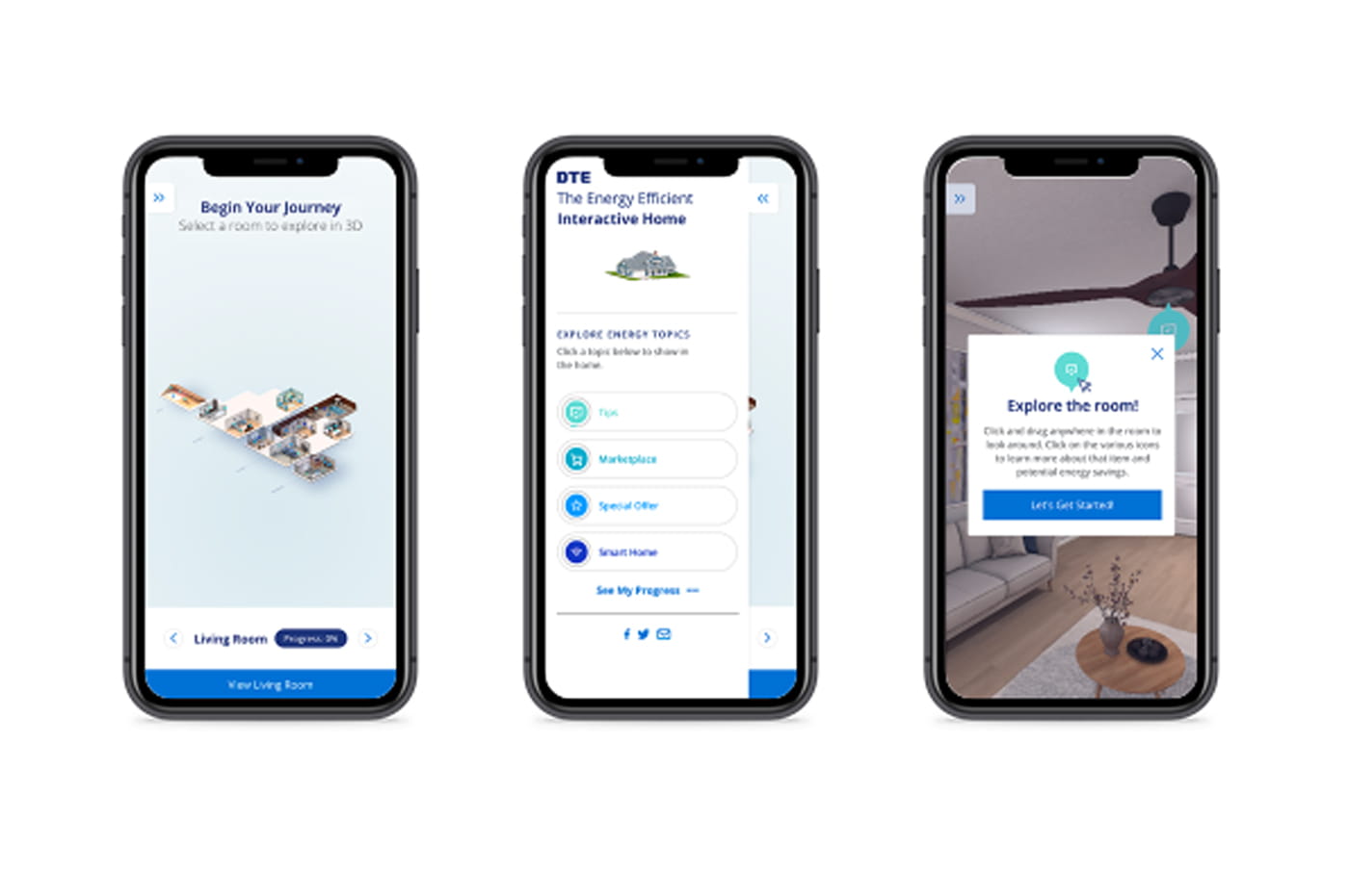
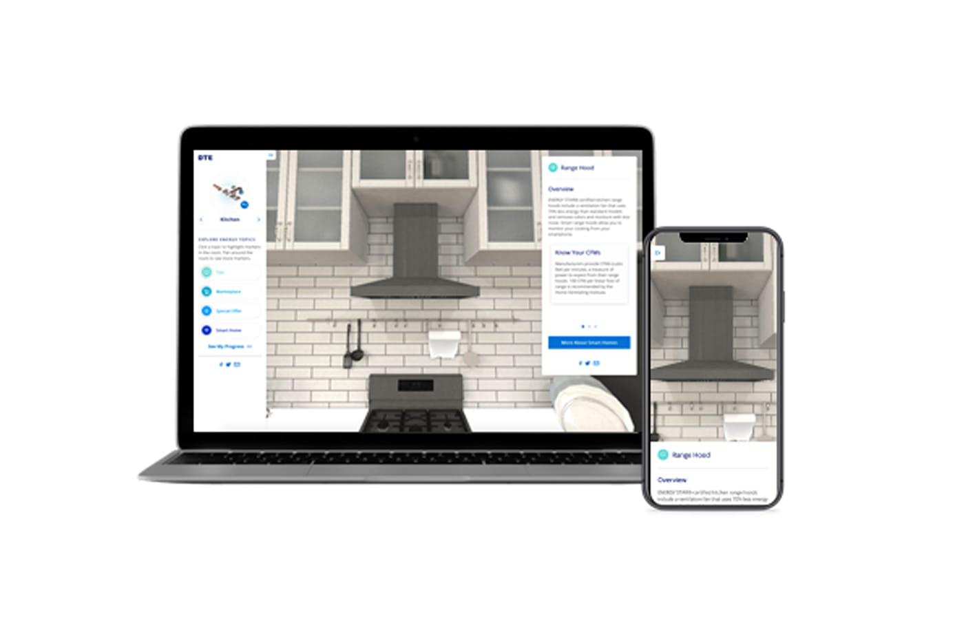
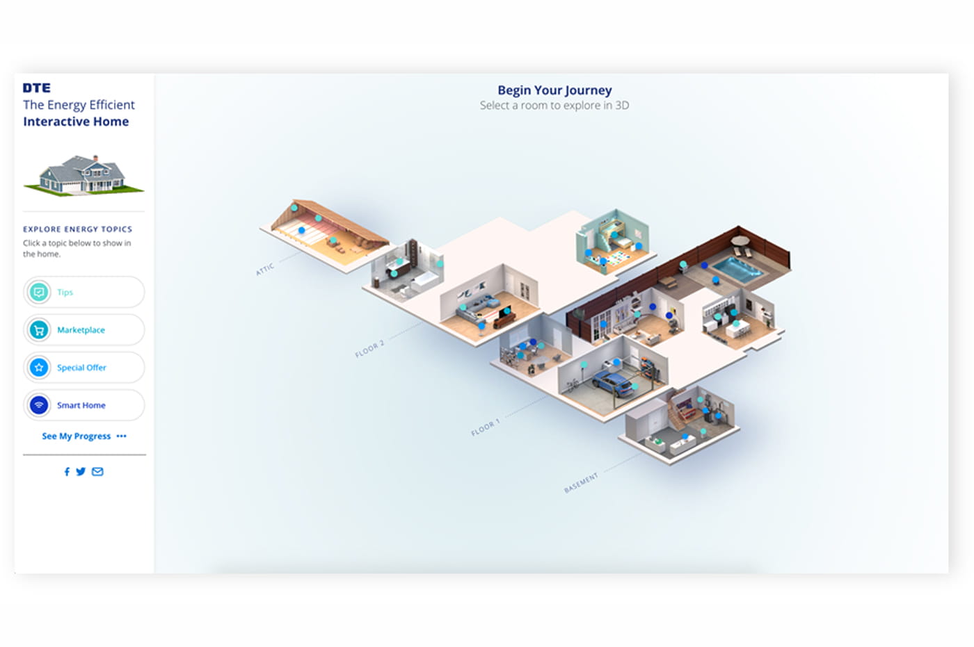
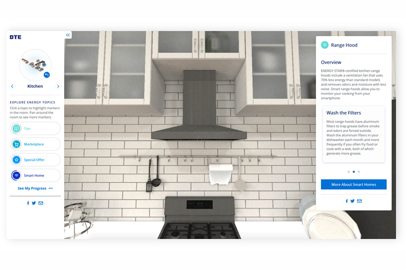
Coolest of all, we designed, built, and created copy for an interactive microsite where customers can explore a smart, energy-efficient 3D virtual home, click on objects, and learn about opportunities to save money and energy.
Zeroing In On Customer Needs
The Interactive Energy Efficient Home experience spans seven rooms, a garage, basement, attic, and areas outside the home with a total of more than 40 clickable hotspots. Each hotspot includes links to relevant Save Money & Energy pages for free products and rebate information, or to the DTE Marketplace, where customers can purchase products at discounted prices.
To make the experience even more engaging, we created badges to accompany each hotspot so customers can track their energy-saving progress through the virtual environment. These badges show how implementing the different tips and using energy-efficient products can translate into cost and energy savings and environmental impact, displaying running totals of hypothetical trees planted (based on reduced carbon emissions), bags of waste recycled, and gallons of gasoline saved.
Customer satisfaction has increased with the updates we’ve helped DTE make so far, and we’ll continue to provide up-to-date strategic guidance and help create a consistent, user-friendly experience for customers using both mobile and desktop.
Flipping the Switch
The successful launch of the new Save Money & Energy section of DTEEnergy.com – including the energy-saving quiz, interactive home experience, and new, streamlined pages – has provided customers with multiple intuitive and engaging ways to learn about saving energy and to save money by taking advantage of the company’s many programs and offers.
The virtual home experience has received industry recognition, earning Platinum at the Hermes Creative Awards, DotComm Awards, the Muse Award, W3 Awards, and Creativity International awards for design, creativity, and interactive capabilities.
MUSE Creative Award Gold Winner
W3 Award Gold Winner
Creativity International Design Award Silver Winner
Hermes Creative Awards Platinum Winner
DotComm Awards Platinum Winner
MUSE Creative Award Gold Winner
W3 Award Gold Winner
Creativity International Design Award Silver Winner
Hermes Creative Awards Platinum Winner
DotComm Awards Platinum Winner
Prioritizing Accessibility
Another customer experience update DTE wanted to make was to improve the digital accessibility of its commonly visited webpages, to ensure all of its customers can find the information and resources they need.
We conducted a deep dive into the most frequently visited pages, branded emails, social media, and audio and video elements and provided recommendations to DTE on how to make them more accessible. These included increasing color contrast, improving the navigation experience when zoomed in, making sure captions and transcripts are in place, and improving mobile voice assistant performance.
DTE approved of our recommendations and we proceeded with implementing them throughout those pages, channels, and elements, creating a more accessible energy experience for all of the company’s customers.

A Focus on Strategy
While our early work with DTE focused mainly on solving tactical, one-off UX issues, we knew that developing a more holistic, strategy-based approach to digital experience would help propel the company forward.
DTE was in the middle of a company-wide rebranding initiative and the new look and feel would need to be applied throughout the company’s digital presence. Since we were already compiling user and industry research and recommendations for DTE for the EWR journey update, it was a great time to go a step further and use our findings and existing industry knowledge to add a new layer of strategic thinking to the company’s overall digital efforts.
Our digital strategy and experience design experts conducted a holistic examination of DTE’s current state, future plans, and goals. We then developed an actionable digital strategy and roadmap to guide the company’s ongoing efforts toward achieving its short- and long-term CX goals.
Creating Consistency in Content and Design
As part of the company-wide brand update, DTE engaged us to help apply the new branding throughout its digital experience. Our design team got to work applying the new fonts, colors, and branding elements throughout DTEEnergy.com, as well as several third-party sites that connect into overall experience.
In conjunction with improved design, our content team reworked all of the existing copy to match the company’s updated Verbal Identity Guidelines, and we incorporated best content practices for utilities to engage with customers (including a more personal tone, rather than addressing the user as “customer”).
We also developed a digital style guide for DTE to help the company maintain consistency in its experience design going forward. The document was created in Figma and includes detailed information and standards for color, accessibility, fonts, icons, photography, and various user interface elements. DTE’s internal teams leveraged this resource to create an evolving design system.
Results

Key Benefits
In addition to creating consistency across the visual design and content of DTEEnergy.com, our work has also created new, engaging avenues for customers to interact with DTE and learn about how to improve their energy experience.
Customer satisfaction has increased with the updates we’ve helped DTE make so far, and we’ll continue to provide up-to-date strategic guidance and help create a consistent, user-friendly experience for customers using both mobile and desktop.
After the success of our early digital work, DTE has begun to explore additional ways to utilize our capabilities and technology partner relationships to improve the customer-facing experience in its website and mobile apps, as well as back-end systems and processes throughout the enterprise.


